
The Ask:
The client wants to be able to better analyze their prospects for their 401(k) business. Our client asked us for help in contextualizing pertinent plan statistics and data points, but they also needed a way to properly frame the data and present it to new prospects in order to win business.
The Problem:
While there is plenty of data publicly available on plans, there needs to be a good way to understand this data. Sure, a plan may have 0.90% in admin fees, but how can an advisor explain to a plan sponsor whether this is high or low? They need a resource that properly puts plan data in context. Even if we know what the average participant contribution is for similar sized plans, what about the other plans in the benchmark? The advisor needs to be able to see the data in context to truly understand it. Arbitrary performance metrics and stating averages is simply not enough.
The Solution:
We’ve created our own Benchmarking system in Larkspur Executive so advisors can show a plan sponsor exactly how they stack up against their peers. In the below screenshot (Figure 1), you can see how our sample plan falls in the 12th percentile of similar sized plans with a Rate of Return of 8.79%.. With our benchmarking chart, we can clearly see how this puts them squarely towards the bottom against similar sized plans.
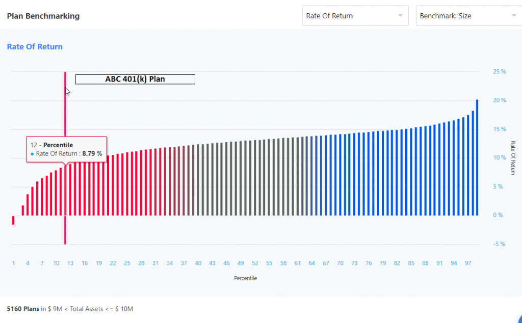
Figure 1
Because we have such an expansive database on many different categories of plan metrics for virtually every retirement plan in the US, we can create powerful benchmarking charts to illustrate how a plan ranks. We can even switch our benchmark from similar sized plans to companies that are in the same business code. This gives advisors a 360 degree view on plan performance against peers of the same plan size and business. Trying to explain raw numbers and plain national averages can give you some rough ideas on how a plan is doing, but being able to pin-point exactly how this data fairs against similar plans in illustrate that visually is invaluable.

Pingback : Case Study: How to Use Comparisons to Alert Complacent Plan Sponsors
Pingback : Case Study: Finding Plans with the Highest Fees
Pingback : Plan Ratings in Larkspur Executive -