
- Why Use Equal Weighted Indexes?
- Market Cap Concentration in the S&P 500
- Different Weightings Result in Different Style Exposures
- What About the Small Cap Premia?
- What About Implementation?
- Equal Weighted has Outperformed Cap Weighted Historically
- The Bottom Line
Lately, it seems the only equity investment worth making is in US large caps. The cheaper and more passive, the better. Of course, passive US large-cap equities are not the absolute best performing asset available over the past few years, but the category is pretty hard to beat for ease of implementation, known risk characteristics, price and performance.
Today’s post will explore the recent underperformance of equal weighted indexes relative to their weighted counterparts. It may be dense at times, but we’ll examine cap structure, style drift, and implementation difficulties to try to explain the diversion. Please drop us a thought or question in the comment section and share if you found the article interesting.
This is close to a thesis but doesn’t say why the underperformance is occurring.
Why Use Equal Weighted Indexes?
Indexes from major providers have long taken criticism for using market capitalization as the major criteria for constituent weighting.[1] This criticism has given rise to numerous alternative weighting schemes, tilts, and even custom benchmarking practiced by some institutional managers. One of the more popular alternative weighting schemes is equally weighting the constituents of established weighted indexes. The allure of equally weighted indexes is that the investor is getting a broader representation of the index constituents, or increased diversification. As an example, Microsoft has a 3.8% weight in the S&P 500 (as of December 2019), but in an equally weighted version of the S&P, Microsoft will only have a 0.2% weight. On the other side, one of the smallest S&P 500 constituents is The Gap, Inc. With a weight of only 0.01%, the performance of The Gap is largely irrelevant to the performance of the traditional S&P 500. If The Gap jumps 50% in a day, the S&P will only see a 0.005% impact on performance. But in the Equal Weighted S&P 500, The Gap has the same weight as Microsoft at 0.2%, so a jump in The Gap will have as much of an impact as a jump in Microsoft.
To illustrate, Exhibit 1 compares S&P 500 Index versus the equal weighted counterpart and shows performance over the last 5 years has favored the weighted index over the equal weight version by about 190bps per annum.
Of course there are also price weighted indexes, such as the widely followed Dow Jones Industrial Index (DJII), which has taken some significant criticism with regards to a methodology which results in some odd weightings. For example, Boeing is the largest member of the DJII because the price of the security is higher than others resulting in a 7.9% weight versus 3.8% for Microsoft, the largest company in the US by market value and the largest weight on the S&P. Boeing has a 0.6% weight on the S&P.
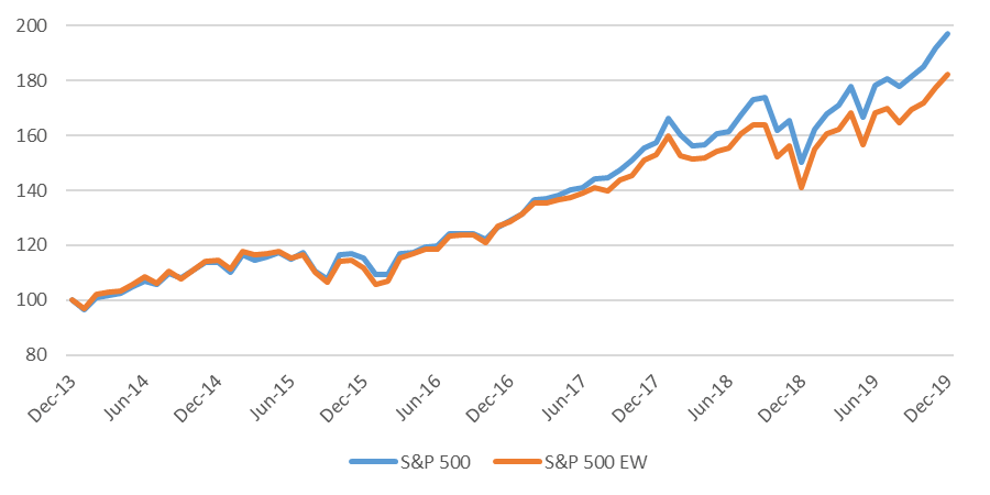
Source: Bloomberg, RiXtrema
Market Cap Concentration in the S&P 500
The top 10 names of the S&P 500 account for 24% of the index (note that I am counting the 2 Alphabet issues as a single company and combining the weight in the index, so I am actually using the top 11 holdings). Investing in an equal weighted version of the index, each holding is weighted equally for about 20bps per holding (or 10bps for each Alphabet issue) and 2.1% in total for the top 10 names. Exhibit 2 shows how these weights impact the allocation of the indexes using market cap deciles (dividing the 500+ names into buckets of ~50 companies based on their index weight) and how these deciles can generate very different performance characteristics for the 2 indexes in a year like 2019.
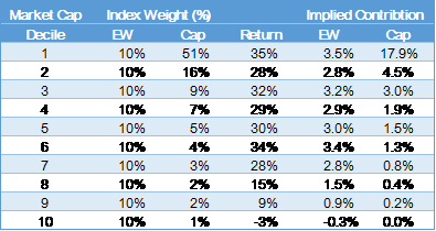
Source: Bloomberg, RiXtrema
Note: Market Cap Deciles are calculated using ending market weights which, in a year like 2019, penalizes the equal weighted index and does not properly attribute returns for intra-year movements of companies between deciles.
The top decile was also the best performing decile, while the bottom 2 deciles were the worst performing. The Cap weighted index had over 50% of its weight in those top 50 top performing holdings, compared to 10% for the equal weighted index. By far the worst performing deciles were 8, 9 and 10, where the equal weighted index held 10% in each decile for 30% in total, versus the weighted index holding about 5% total in all 3 deciles.
Different Weightings Result in Different Style Exposures
A side benefit of increased diversification in equal weighted indexes is that investors could ‘cheat’ the cap structure, meaning that they could invest in large cap securities of the S&P 500 but obtain a much smaller market cap representation. For example, a mandated large cap allocation that is filled with an equal weighted investment is a smaller market cap representation of that large cap bucket. Consider a style analysis of the S&P 500 against the equal weighted version of the index. Exhibit 3 shows that the equal weighted index gets much more mid cap and value exposure at the expense of large cap growth. The last column of exhibit 3 shows the return of the components over the last 5 years, and the indexes at the bottom. It should be clear that the tilt away from large cap growth to value and mid-caps has been very detrimental for the equal weight index over the past 5 years.
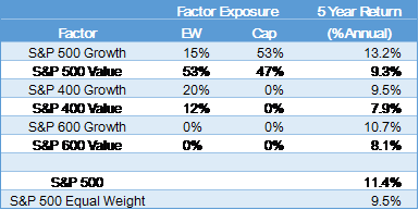
Source: Bloomberg, RiXtrema
What About the Small Cap Premia?
Once upon a time there were ‘premia’ assigned to asset classes that are expected to beat large caps over time. For example, small cap stocks have historically returned a ‘small cap premia’, or an excess return to investors that have accepted the additional risks associated with smaller companies. I started this research with the theory that this (and other) equity premia haven’t been available for at least 5 years. And as I began research into what has happened to the small cap risk premia, I came across an article from a former colleague, Rolf Agather who is now an MD of US Research for Russell. His research, summarized in the post “What have you done with my small cap premium”, finds that the small cap premia has been largely unrealized over the last 40 (!) years. His findings below.
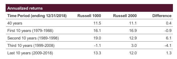
Source: FTSE Russell data
Agather works for Russell, so he used their indexes for his analysis. I started my research using the S&P (500 vs. 600) and found some variations in the results as the S&P 600 has outperformed the Russell 2000 over the history I have available. But as noted in Agather’s blog post, the results will be time dependent, and either way, the history behind the premia (small cap, EM, International) are a bit outside the scope of this post. But the lack of premia on offer is certainly one of the reasons that the equal weighted S&P has underperformed the weighted counterpart .
What About Implementation?
And this doesn’t begin to touch on the implementation difficulties associated with equal weighted versus weighted ETF implementation. The implementation difficulties are minimal in US large cap, but there is still slippage. Below in Exhibit 5, I examine the S&P focused indexed we have been using in this post against their ETF counterparts.
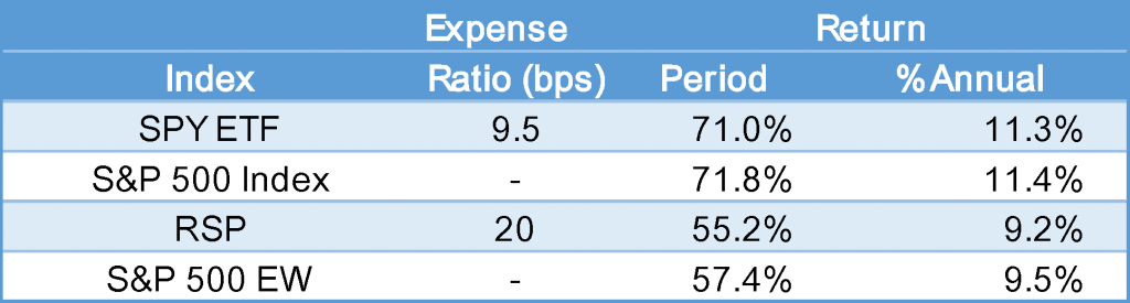
Source: Bloomberg, RiXtrema
The SPY, the largest S&P 500 ETF, has trailed the index by 10bps per annum over the last 5 years. This 10bps also happens to be the expense ratio of the ETF, so you are getting the S&P 500 Index return less the expense ratio. By comparison, the Invesco S&P 500 Equal Weight (RSP US Equity on Bloomberg) is a $16.8Bn ETF and the largest equal weight ETF I could find, trailed the benchmark by 38bp per annum, which is 18bps more than can be explained by the expense ratio. Over the 5-year period with compounding, this difference can add up, and this likely grows with complexity of implementation.
Equal Weighted has Outperformed Cap Weighted Historically
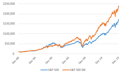
Investors have come to expect that they will be rewarded for investing in the more representative equal weighted S&P 500. With data going back to 1990, Exhibit 6 shows that the only 5-year period that the cap weighted index outperformed was during the dot-com boom of the late 1990s, another period where investing in growth and momentum paid off. But since 1990, the equal weighted S&P 500 has outperformed the weighted index by 1.2% per year. While that may not seem like that much, Exhibit 7 shows how a $10,000 investment in 1990 would grow to about $240k in the equal weighted investment compared to $172K for the weighted version, a difference of more than $67,000.
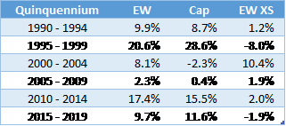
Note: A Quinquennium is a 5-year period. I had to look that up as I had no idea what to call a half-decade.
Source: Bloomberg, RiXtrema
The Bottom Line
In the US, mega-caps have outperformed others, particularly the largest growth-oriented stocks have performed very well over the last 5-years. Shifting exposure away from these securities, as occurs when investing in equal weighted indexes, has been detrimental. The bottom line is that to employ an equal weighted strategy over a weighted strategy, one needs to understand the primary drivers of relative returns so that over/underperformance doesn’t come as a surprise. Because what happened with the S&P 500 over the past 5 years, has not necessarily held for all other equally weighted variants of other indexes. Maybe we’ll explore that in a later post.
You can see all our industry and market analysis at our blog, rixtrema.com/blog, where we also showcase the features of our financial planning and risk software platform. Please contact our Client Success Team at clientsuccess@rixtrema.com with any questions about Rixtrema Inc. or its products. Please drop us a thought or question in the comment section and share if you found the article interesting.