Below is your complete guide (with corresponding screenshots) to the 401kFiduciaryOptimizer 404(c) Diversification Report:
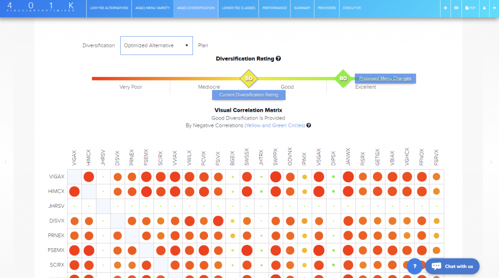
Figure 1. 404(c)Diversification Report
Diversification addresses a plan lacking diversifying investments; it does not address overlap in the menu. It is based on adjusted similarity (the formula is right on the Diversification page at the bottom). The menu is diversified according to ERISA if “participants are able to reduce the risk of major losses”. They are able to reduce that risk if there are diversifying investments, like bonds or bond funds.
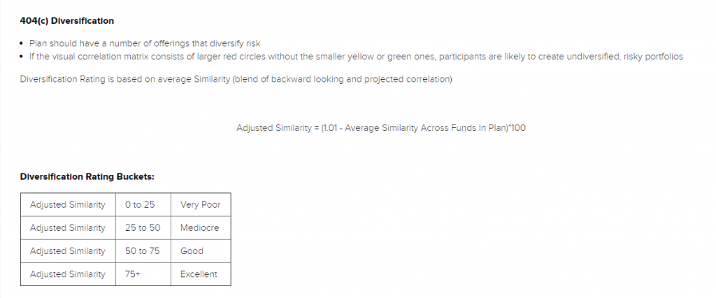
Figure 2. Adjusted Similarity Formula
Diversification rating is visually presented in the 401kFiduciaryOptimizer tool, in a simple and easy to understand way. The Diversification Rating is the number in the diamond-shaped box, scaled in the range of 0-100, from Very Poor (closer to 0) range to Excellent when the rating is closer to 100. (Figure 3)

Figure 3. 404(c) Diversification Rating
Although the report gives you an option to check the Diversification rating of the original menu, as a way to have additional information, it really is not necessary to use that. It is best to analyze your proposed alternate menu diversification for optimized alternatives since they are very similar to the original menu funds. To switch between original and optimized Alternative menus, use Diversification Plan Switch at the top left of the report. (Figure 4)
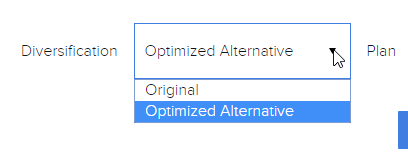
Figure 4. Diversification Plan Switch
The Diversification Rating is based on the Diversification matrix below. It shows you how original or proposed funds (depending on currently selected Diversification Plan Menu) correlate between each other.
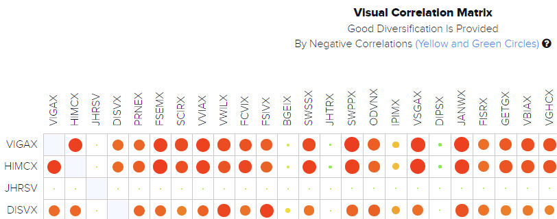
Figure 5. Diversification Correlation Matrix
The level of correlation is a bubble, having the same color based concept as the Diversification Rating strip coloring, where the big bright red bubble is a high correlation pair of funds, and big bright green is the highly negative correlated pair (Figure 6). The idea is simple – less red and more green color in the matrix is better for the diversification, making the plan better protected against market volatility.
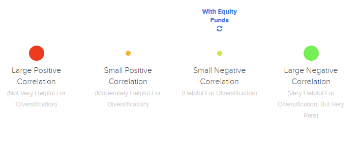
Figure 6. Diversification Matrix Coloring Legend
The matrix is drawn only if there are no more than 40 original/alternative funds in the plan. Empty cells are Target Date funds correlations which are not calculated. They can be excluded from the matrix view by unchecking the Correlation With Target Date funds box. See Figure 7:
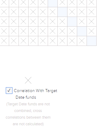
Figure 7. Correlation with Target Date Funds Check-box
The Diversification Rating can be improved by using the Improve Diversification button, as illustrated below in Figure :
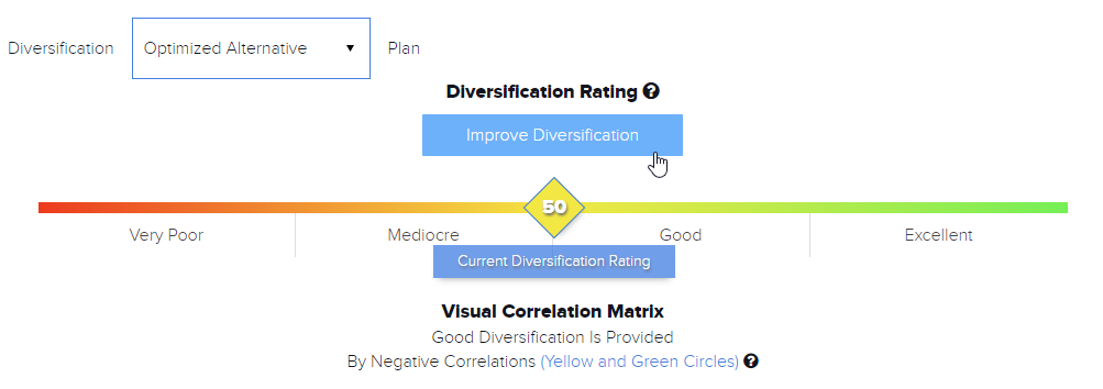
Figure 8. Improve Diversification Button
Click on some of the funds labeled as Click to Select for Funds Swap and see how your diversification improves by swapping to the diversifying fund with Negative Similarity and lower New Expense Ratio.
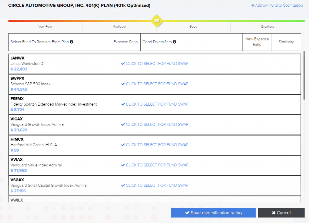
Figure 9. Swapping to Diversifying Funds to Improve Diversification
Adding 1 or 2 more diversifiers will give you much better diversification, but adding too many diversifiers might end up with the rating going down, as those newly swapped diversifiers will start to correlate highly between each other.
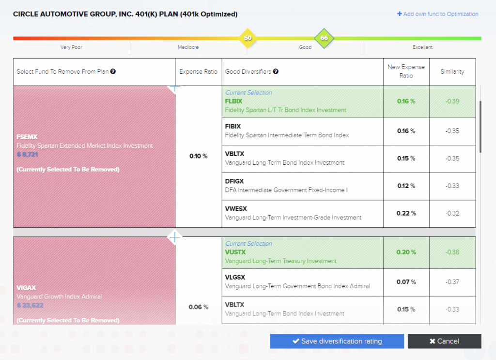
Figure 10. New Diversifying Funds in Improve Diversification
If you have a diversifying fund in mind, you can add it to the menu by using “+Add own fund to Optimization” option in the top right. Start typing a ticker or a part of the asset name, and select it from the drop-down list. See Figure 11:
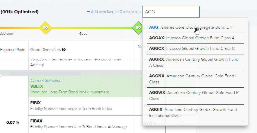
Figure 11. Add Own Funds to Diversification Optimization
Then simply click the “Save Diversification Rating” button at the bottom to save your better diversified proposed menu:

Figure 12. Save Diversification Button
Your new diversification score is displayed next to the old one on the diversification scale. Diversification matrix now has more green color bubbles and green names of diversifying funds. To do a quick comparison of previous and new diversified matrixes click on corresponding diversification rating numbers. (Figure 13)
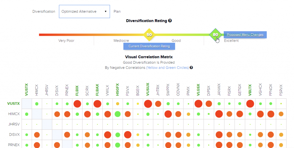
Figure 13. New Diversified Rating and Diversification Matrix
Both Diversification matrixes will be included in the PDF report of the plan, if you have the 404(c) Diversification Report checked in the PDF wizard menu.
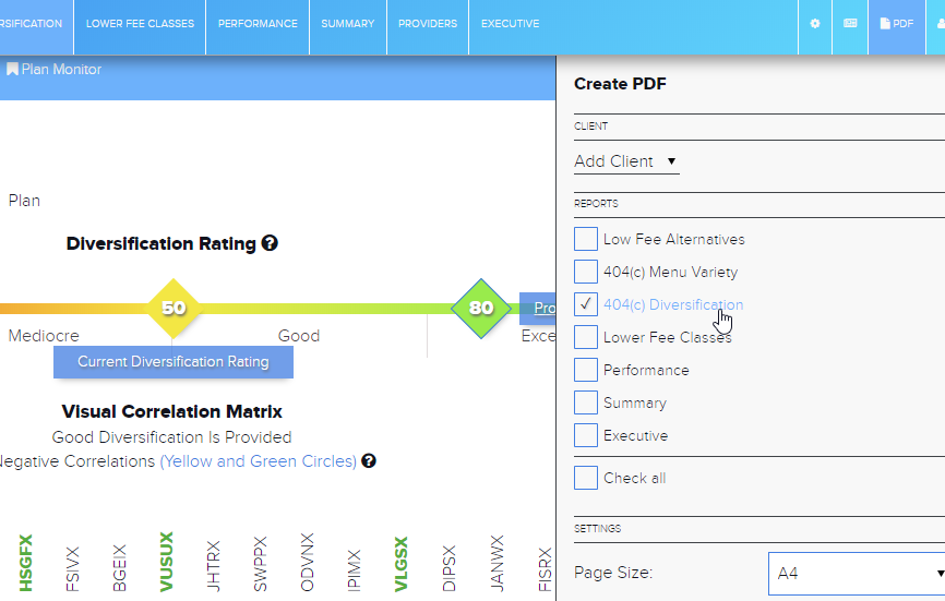
Figure 14. Adding 404(c)Diversification to PDF report of the plan
To remove the new diversification score and matrix, click on Proposed Menu Changes and click on every fund in pink boxes that has diversifying funds selected, then click on the Save Diversification Rating button again.
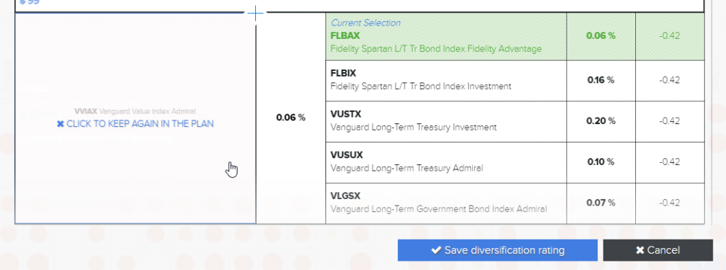
Figure 15. Removing Diversification Optimization
Extra Examples
You can hover your mouse over to any point in our diversification matrix to see a similarity between two funds. Any fund with a strong, positive similarity will have a large red circle. Too many large red circles could indicate that there are too many quantitatively similar funds in a plan menu indicating poor diversification options.
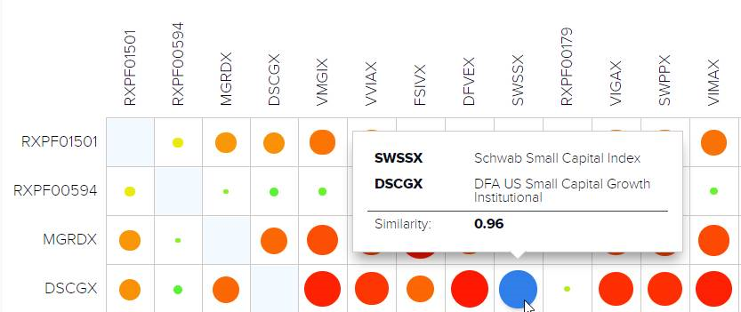
Figure 16. SWSSX and DSCGX have a very high similarity of 0.96
On the other side of the spectrum, smaller or larger green circles represent a negative correlation between funds. Having several rows of smaller green circles can be very helpful diversifiers for a plan menu.
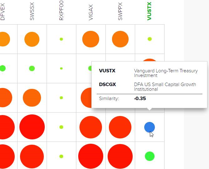
Figure 17. VUSTX and DSCGX have a negative similarity of -0.35
Be sure to schedule your full demo of the 401kFiduciaryOptimizer below:


